

I’ve been curious about using Angular Elements for quite some time, but have never had the push I needed to dive into how to develop and deploy them. Specifically I’ve been curious about using a web component, developed in Angular, to add functionality to a JQuery or straight HTML page. Recently I’ve had the opportunity to start thinking about this again, as I have a legacy application written in PHP and JQuery that is growing and becoming difficult to properly maintain (Tech Debt!). I’ve been looking at how to approach a “revamp” of this application, and Angular has been one of the roads I’m entertaining.
To rewrite it from scratch in one go would be daunting. I want to deliver value along the way, not have two codebases to maintain, and not feel like it’s an endless slog! My plan is to use what Martin Fowler, in 2004, called the Strangler Fig pattern. Build small pieces of my old application, in my new language, slowly removing the functionality of the old and bringing the new in until there is no old left. One way I feel I can do that is introduce Angular elements in my old application, to also be used in my new concurrently. This seems to fit my needs! So how do we inject these custom Angular elements into the old code? Let’s take a look at how I might approach this.
The Code
We start with our component’s HTML file. For this exercise, we create a new component called custom form. There’s nothing special here, it’s simply a form. We are using a simple example to be able to focus on the important pieces of our build.
<form [formGroup]="medicalForm" (ngSubmit)="onSubmit()">
  <mat-form-field>
    <input matInput formControlName="nameInput" placeholder="First Name" />
  </mat-form-field>

  <mat-button-toggle-group
      id="ageSelection"
      #group="matButtonToggleGroup"
      formControlName="ageGroupInput"
    >
      <mat-button-toggle value="1" aria-label="Text align left">
        <span>1-12</span>
      </mat-button-toggle>
      <mat-button-toggle value="13" aria-label="Text align center">
        <span>13-18</span>
      </mat-button-toggle>
      <mat-button-toggle value="19" aria-label="Text align center">
        <span>19-25</span>
      </mat-button-toggle>
      <mat-button-toggle value="26" aria-label="Text align center">
        <span>26-35</span>
      </mat-button-toggle>
      <mat-button-toggle value="36" aria-label="Text align center">
        <span>36+</span>
      </mat-button-toggle>
    </mat-button-toggle-group>

  <mat-button-toggle-group
    id="originSelection"
    #group="matButtonToggleGroup"
    multiple
    formControlName="raceInput"
  >
    <mat-button-toggle value="white" aria-label="Text align left">
      <span>White</span>
    </mat-button-toggle>
    <mat-button-toggle value="black" aria-label="Text align center">
      <span>Black</span>
    </mat-button-toggle>
    <mat-button-toggle value="native" aria-label="Text align center">
      <span>Native American</span>
    </mat-button-toggle>
    <mat-button-toggle value="hispanic" aria-label="Text align center">
      <span>Hispanic</span>
    </mat-button-toggle>
    <mat-button-toggle value="other" aria-label="Text align center">
      <span>Other</span>
    </mat-button-toggle>
  </mat-button-toggle-group>
    <button mat-button>Submit</button>
</form>
Like our HTML file, our component.ts file for the element we want to use has almost no functionality. We kept this simple so that we can focus on the important parts, the functionality that allows us to inject this element into an application. This simple component is built to use in another site.
import { Component, OnInit } from '@angular/core';
import { FormControl, FormGroup } from '@angular/forms';

@Component({
  selector: 'app-custom-form',
  templateUrl: './custom-form.component.html',
  styleUrls: ['./custom-form.component.css']
})
export class CustomFormComponent implements OnInit {

  medicalForm: FormGroup;
  constructor() { }

  ngOnInit() {
    this.medicalForm = new FormGroup({
      nameInput: new FormControl(''),
      raceInput: new FormControl(''),
      ageGroupInput: new FormControl('')
    });
  }

  onSubmit() {
    console.log('Our data is ', this.medicalForm.value);
  }
}
Next is our app.module.ts. The first part to notice, is that there is no AppComponent in our import or our @NgModule declarations. Since we’re not running this as an Angular application, we do not have to declare an AppComponent. Instead we declare our CutomFormComponent, the one we want to use in our HTML file, and then set it up as an entryComponent in @NgModule. We do this because we’re not referencing the element in a template in this Angular application, we are loading this imperatively.
@NgModule({
  declarations: [
    CustomFormComponent
  ],
  imports: [
    BrowserModule,
    BrowserAnimationsModule,
    MatButtonModule,
    MatInputModule,
    FormsModule,
    ReactiveFormsModule,
    MatButtonToggleModule
  ],
  providers: [],
  entryComponents: [ CustomFormComponent ]
})
Next, we edit the constructor to create our custom element, and inject it into the current window. The injector provides the interface for us to inject our new element into a page. Our first order of business is to call createCustomElement, which comes from our @angular/elements package. This function converts our component into a class and makes it ready to inject into our custom element registry. We provide our custom component, as well as a configuration object into the function. Here we are providing the injector. Then we register that new customElement into the window element’s customElements property. This is a read only property that references the CustomElementRegistry. As you can see here, we give it the name of our new HTML element, as well as the customElement variable we just created.
We then have an empty ngDoBootstrap(). This method is used for things like determining the order of bootstrapping of components. We don’t need to specify this, as Angular Elements are self bootstraping, that is they are automatically started and destroyed. The reason it is here is to avoid compiler errors, and that’s all. After this, the browser is ready to use our new, custom, element.
export class AppModule {
  constructor( injector: Injector ) {
    const customElement = createCustomElement(CustomFormComponent, {injector});
    customElements.define('app-custom-form', customElement);
  }

  ngDoBootstrap() {}
}
Here is the full app.module.ts file.
import { BrowserModule } from '@angular/platform-browser';
import { NgModule, Injector } from '@angular/core';
import { createCustomElement } from '@angular/elements';

import { MatButtonModule } from '@angular/material/button';
import { MatButtonToggleModule } from '@angular/material/button-toggle';
import { MatInputModule } from '@angular/material/input';
import { FormsModule, ReactiveFormsModule } from '@angular/forms';

import { BrowserAnimationsModule } from '@angular/platform-browser/animations';
import { CustomFormComponent } from './custom-form/custom-form.component';

@NgModule({
  declarations: [
    CustomFormComponent
  ],
  imports: [
    BrowserModule,
    BrowserAnimationsModule,
    MatButtonModule,
    MatInputModule,
    FormsModule,
    ReactiveFormsModule,
    MatButtonToggleModule
  ],
  providers: [],
  entryComponents: [ CustomFormComponent ]
})

export class AppModule {
  constructor( injector: Injector ) {
    const customElement = createCustomElement(CustomFormComponent, {injector});
    customElements.define('app-custom-form', customElement);
  }

  ngDoBootstrap() {}
}
The Build Process
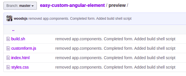
To get this to work with an HTML page, we need to build the functionality and concatenate all of the resulting files down into a single, reusable module. We start with building a preview folder. You can call this folder anything you would like, as long as the folder is at the top level directory in your Angular project. This folder is going to hold our build script, the result of that script, and anything we need to test that the build was successful. We add a plain HTML file that uses our custom element to test the output of the process.
Our build script does our non-magic. Once our build process is complete, the script dives into our dist folder and concatenates the resulting javascript files into a single file. Finally, it copies our css file from the dist folder of this project into our preview folder.
#!/bin/sh
echo 'concatenating files'
cat ./dist/custom-form/runtime-es2015.js \
./dist/custom-form/polyfills-es2015.js \
./dist/custom-form/scripts.js \
./dist/custom-form/main-es2015.js > ./preview/customform.js && \
cp ./dist/custom-form/styles.css ./preview/styles.css
We add a build:prod entry to the scripts property in our package.json. This runs the production build of our element, and then our build.sh script.
  "scripts": {
    "ng": "ng",
    "start": "ng serve",
    "build": "ng build",
    "test": "ng test",
    "lint": "ng lint",
    "e2e": "ng e2e",
    "build:prod": "ng build custom-form --prod --output-hashing=none && ./preview/build.sh"
  },
Finally we have our HTML file. It simple loads our component’s css file, loads our script file, here called customform.js, and calls our new custom element app-custom-form.
<pre class="wp-block-syntaxhighlighter-code"><html lang="en">
<head>
  <meta charset="utf-8">
  <title>CustomForm</title>
  <meta name="viewport" content="width=device-width, initial-scale=1">
<link rel="stylesheet" href="./styles.css"></head>
<body>
  <app-custom-form></app-custom-form>
<a href="http://./customform.js">http://./customform.js</a></body>
</html></pre>
At the command line, we run the following command
npm run build:prod
Now we navigate into our preview folder and open the HTML file in a browser. The form shows!

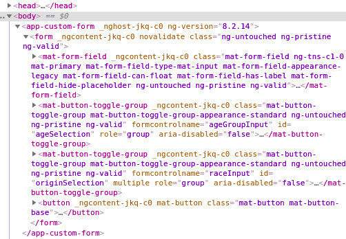
And that’s it. We now have a working custom Angular element, ready to use in other projects that are NOT Angular projects. Above we show that it can be used in a plain HTML file. We don’t dive into the use of @Input or @output, or any other deeper functionality in the element. Those items can be explored by you, dear reader!
The example project above can be found on github here.